.png)

Learn the forms to grasp the functions
Different fonts have different emotions, different
purposes, and different ways they can be displayed.
Understanding the classifications of these fonts,
what combos look godd together, and how they
differ in print and web is key to using the right font
for the job.
Classification
Serif
Small extensions on feet
and arms. Used primarily
for body text.

Sans Serif
Like serifs but with
no extensions. Used
in any situation but
best used for headlines.

Display
Overly flashy and
decorative. Draws
attention but more
difficult to read than
standard text. Use
in titles only.

Script
Fonts wretten by hand
usually in cursive. Can be
formal or casual. Very
difficult to read. Avoid if at
all possible.

Type Mixes
Type Mixes
Before starting a project you will want to
find the type that best fits the scenario
but can be boring for someone to read. For
these instances you will want to mix it
up and use more than one style
of type.

Type Families
When choosing a font it is acceptable
to use a sans serif for the entire thing.
This is because sans serifs feature
large type families, different font
options in a single typeface. Since
they were all designed togehter they
will have similar features that make
the type unique.

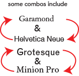
Combinations
Mixing fonts toghether is similar to mixing
colors on the color wheel to get a color
palette. The best combinations are
usually complementary such as fonts
with think and thin lines or pairing an
elegant font with a formal one.
The important part is to find a close balance.
