.png)

Control the flow of the page
When you think of hierarchy you probably think of importance
and that is exactly what it is. Properly using hierarchy guides
the reader by making text LOUDER!! or MORE EXCITING!
Going overboard can make your type look goofy and
inconsistant, which leads to bad design. In this section we will
explain some of the ways that hierarchy can be achieved such as larger
fonts, thinker weights, or different styles.
Structure
Structure
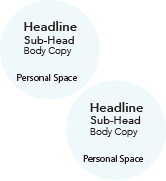
Anybody surfing the web or reading
a magazine will glance over the bold
headlines for something interesting then
begin reading the text associated with it. By
giving the content it's personal spance the
reader will subconciously know what
goes together.

Scale
One of the key components of
establishing structure is with scale.
Just like in public spaces, bigger
people tend to stand out more than
smaller people. A readers eye will
be drawn toward the largest text on
the page and work their way toward
the content they want.

Contrast
Contrast
One of the best ways to draw attention
is contrast. Contrast is a design
element in which something is
strikingly different from everything
around it. This is the core concept
in establishing hierarchy.

Color
The simplest way to achieve contrast
is with color. When wading thorough
a sea of black text on a white page,
seeing a solitary source of red will hit
you like a puch to the face. To see
what kind of color will get you that
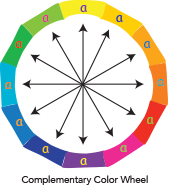
kind of impact, it is best to look at the
color wheel for complementary colors.

Emphasis
One of the most common uses for
contrasting with color is to add
emphasis to a single object or set
of objects. This helps draw the
reader to see what you want them to
see (be it a hidden message, or a
button prompting action).
